|
In this special two-part edition of The Digital
Edge, well examine international packaging
design. In this edition we look at how
internationalization and localization affects
package design. Next time well examine the
technology necessary to design international
packaging software applications, fonts,
operating systems, and keyboards.
International Packaging Design
In his 2005 best selling business book,
The World Is Flat: A Brief History of the
Twenty-first Century, author Thomas
Friedman reminded us that all companies,
big and small, have the ability to sell
their products and services, globally.
Companies like Microsoft, Gerber,
PepsiCo, Sony, and Nestlé, market their
products all over the world. In order to
do so, these companies design unique
localized packaging based on the region
and its cultures.
Internationalization and Localization
Most of the packaging in the United
States is designed specifically for the
domestic market. Design elements such
as text, images, and color - are based on
uniquely American cultural values and
social norms. Marketers tailor packaging
to specifically attract the attention of
United States consumers. All nations and
regions of the world have their own unique
cultures, which must be understood when
designing localized product packaging.
Designing a new package, or adapting
existing packaging for foreign markets
requires two complimentary processes
internationalization and localization.
Internationalization (sometimes called
globalization) is the process of removing
all cultural, political, religious, historic, and
ethnic idiomatic phrases, colloquialisms,
metaphors, slang, jargon, terminology,
images, graphics, and even colors from
an existing package, in order to repurpose
it for another, non-native region. In order
to create a more universally acceptable
package, designers often substitute
recognizable graphic icons for product
usage directions, disposal, recycling, and
safety instruction copy. Package designs
that rely too heavily on typography or
local imagery are often difficult to convert
effectively to foreign markets.
The result of internationalization is a
culturally neutral package template, which
can be repurposed for multiple global
markets.
Once the process of internationalization
is complete, localization can take place.
Localization is the process of adapting
a packages contents, design, and
marketing message to reflect local cultural
sensitivities. Text is translated and images,
artwork, and colors are selected, based on
local cultural norms and social values.
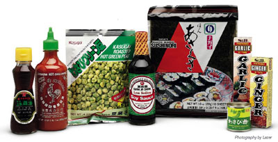
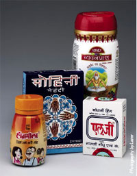
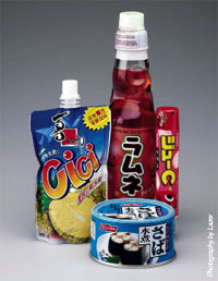
Most consumers only exposure to international packaging is an occasional trip to the local Chinese Food Store or Italian Delicatessen. These food products, with their bi-lingual packages, are imported into the United States specifically for the Asian-American community.
Translation
Translation of text is the most obvious
step in the localization process. Wikipedia
loosely defines translation as the
interpretation of the meaning of a text in
one language (the source language) and
the production, in another language (the
target language), of an equivalent text,
which communicates the same message.
Word-for-word translation of text from
one language to another is analogous
to learning to speak a foreign language
without learning the proper pronunciation
or phrasing its literally correct, but
difficult to understand by someone who
speaks the native language. Localization
of text is best performed by a translation
specialist who is fully conversant in the
native language. Localization requires an
idiomatic understanding of both the source
and the target languages. Translators also
convert weights and measures, dates,
times, and currency formats to regional
conventions. Translators adapt legal copy,
safety warnings, nutritional facts, disposal
and recycling information, and food
ingredients, to meet local regulations.
Localized packaging often contains
more than one translation. For example,
packaging for the North American market
which has grown rapidly with the advent of
NAFTA, is often trilingual English for the
United States, Spanish for Latin America,
and Quebec French for Canada. Likewise,
European packaging frequently contains
translations for multiple languages. The
European Union, comprised of 27 member
states, has 23 official languages.
When setting multilingual copy there
are a number of factors to be taken into
consideration. The cultural make-up of the
target audiences may determine the order
that the language translations appear
and their relative font sizes. Government
regulations in some counties can influence
the order of priority and relative size of
multilingual copy.
Images and Artwork
An image is worth a thousand words
it is said, and is therefore often they
most culturally sensitive elements of the
packages design. In addition to text,
designers must localize images and
artwork. Designers should refrain from
using photographic images and artwork
that contain sexual, racial, religious,
political, and race- and gender-specific
themes. This includes the use of certain
body parts, animals, geographic locations,
and social settings, as well as national
symbols like flags.
There is the now famous legend of how
Gerber baby food was first sold in Africa,
using the same packaging that used in
the United States featuring the cute
Gerber baby on the front. What Gerber
failed to realize was that in many thirdworld
countries, like Africa, it was common
practice to feature a picture of the food
packages contents on front label to assist
the largely illiterate population. Of course
you can imagine the horrified reactions of
the local residents to seeing the babys
face prominently featured on the front of
the package!
Color
Color should also be examined for cultural
sensitivities when designing product
packaging. White for example, a symbol
of purity and cleanliness in Western
cultures is often worn at weddings, but
is the predominant color at funerals in
Asian cultures. Conversely black, is worn
during times of mourning in the West, but
is strictly a color of formality in the Asian
cultures, and is considered to bring good
luck at weddings. Red, the color of passion
in Western societies and representing
happiness and cultural festivity in China,
is conversely a sign of purity in India. In
Japan, red can have a negative marketing
connotation because of its use for price
tags on deeply-discounted products. Blue
is regarded by many experts to be the
most culturally-neutral color. In both the
West and East, blue represents peace and
serenity. In the West however, blue can
also represent depression and sadness.
The same variations in symbolism can
be found in other colors as well. When
designing for a global audience, cultural
bias for color symbolism must be
considered.
Best Practices
Experts recommend that the last step
in producing localized packaging for an
international market should be a localized
marketing review. A packages contents
and design elements should be evaluated
for marketing effectiveness as well as
cultural sensitivities by an in-country
representative. Full compliance with local
regulations and conventions should be
verified.
Next time well examine the technology
necessary to design international packaging
software applications, fonts, operating
systems, and keyboards.
Gary Stafford is the
President of Lazer Incorporated. As a premier graphic communications
provider, Lazer specializes in digital imaging, design and
mechanical layout, electronic prepress, catalog and packaging
development, Digital Asset Management (DAM) and service,
service, service.
Email: garys@lazerinc.com
Company Profile:
Lazer Incorporated
Company URL:
Back to Columns
page
|