|
Space or No Space
Q. There is discussion in my office about whether it is acceptable to put spaces before and after em dashes. We see it a lot on the Web, but not so often in print. Can you settle this for us?
A. Good question, and one that gives me the chance to expound on a typographic detail near and dear to my heart! Here's the low-down: the space surrounding en and em dashes (as well as the width of the dashes themselves) varies from font to font. In many fonts, the en and em dashes have little or no space around them, making them set very tightly to the surrounding text.
In print, the addition of space around dashes is a question of esthetics; in the United States, it's common to add some space around tight dashes, but the practice can vary in other countries. You'll occasionally see a full word space added before and after dashes in print, but if the font in question has a large word space value (as many do), it can look too open. I personally don't like tight dashes and use the kern function to have complete control over how much space I add. Whichever method you choose is a question of taste, as either is an accepted typographic practice.
On the Web, it's a different story entirely. Unlike in print, Web copy flow (and the rag it creates) varies from user to user, depending on the browser, monitor resolution, and default font style and size. Because of this, you often see unsightly, deep rags resulting from narrow columns of copy containing long words, made worse by the lack of hyphenation in most Web copy. For this reason, I recommend adding a word space around dashes in Web copy to allow for more line break options.

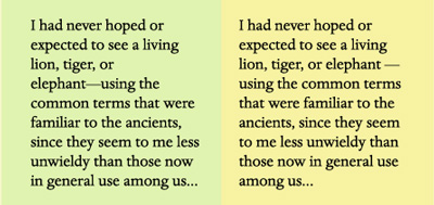
Figure 1. The example on the left illustrates how a bad rag can result in Web copy when you don't add spaces around an em dash. The browser reads "elephant—using" as one word, and since there is no hyphenation on the Web, it carries the entire phrase to the next line, creating an unsightly hole. In the example on the right, I added word spaces around the em dash, allowing the browser to break the line in a more pleasing way. Set in Dante Pro, excerpted from The Lost Continent, by Edgar Rice Burroughs.
Printed Font Directories for Mac and Windows
Q. What's a good way to make a printable directory listing of all the fonts in my folders on my Windows system?
A. My suggestion is to use one of two excellent font managers: the $99.95 Insider Software FontAgent Pro or $99.95 Extensis Suitcase for Windows. (Both are also available for the Mac; the Mac version of Suitcase is called Suitcase Fusion.) Both allow you to print directories of your fonts. Here's how:
FontAgent Pro lets you print font directories (also called "specimen books") in a couple of ways. Use the Font Compare feature to select fonts and preview them side-by-side on your screen. You can customize the text, including the size, color, and background. From there you can print a specimen book with samples of the text. Each font is labeled by name.
You can also use the Font Player to cycle through a selection of fonts on screen and print those previews. Preview templates include Paragraph View, ABC123, and Custom Text. These views are also customizable by point size, text, and background color.
To make and print a directory listing in Suitcase for Windows, simply go to the Print Font Sample Pages command (Control-P/Command-P or Print Sample Pages in the file menu). From there you can print samples from fonts in folders or from the Vault (new to version 11).
Dingbat Derivation
Q. I'm curious about the origin of referring to graphic symbols and fonts as "dingbats." What was a dingbat, before the word was applied to type?
A. The word "dingbat" began as a colloquial term for anything you didn't know the name of, similar to "thingamajig." According to Allan Haley, Director of Words and Letters for Monotype Imaging, "the word 'dingbat' was given to symbols and sorts by 19th-century printers. It was easier to say 'dingbat' than ornaments, sorts, borders, logos, pointers, etc."
Probably the most well-known dingbat font is ITC Zapf Dingbats, designed by Hermann Zapf. This dingbat font became available to thousands of users when Apple licensed it from ITC and built it into Apple's LaserWriter Plus.

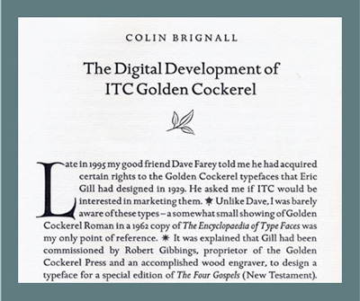
Figure 2. This page from Golden Cockerel Type uses dingbats from the ITC Golden Cockerel Initial Ornament font in decorative as well as functional ways (as paragraph separators). Published by ITC.
Reflow Woes
Q. I design a newsletter in QuarkXPress 6.5 using the OpenType version of Minion Pro. When the client prints out the newsletter, type re-rags throughout the document. This presents a constant problem!
A. I'm assuming your client is printing from your native files and not PDFs, which would eliminate this kind of problem. The easiest fix is to export the newsletter as a PDF with properly embedded fonts and send that to the client. It's the most reliable way for all parties to view and print the same, exact thing.
If for some reason that's not feasible for your workflow, here are a few alternatives:
Check that your client is using the same font as you. Minion was released by Adobe in 1990 as a Postscript font, so the client may have that, not the OpenType version, which could result in text reflow. If you both use Minion Pro, which is the OpenType version, there could still be differences because Minion Pro is available as Opticals in both regular and condensed versions. That means there are additional versions for captions, subheads, display and the like, which could also cause re-ragging.
Make sure you're both using the same versions of QuarkXPress. (By the way, I highly recommend upgrading to QuarkXPress 7.x, which has greatly improved OpenType handling.)
Primes vs. Quotes
Q. The copy we receive from clients often has dumb quotes, or a combination of dumb and smart quotes. To avoid a tedious search and replace to change them all to smart quotes, we import text use the Place command (QuarkXPress) and Get Text command (InDesign) with the Convert (Typographer) Quotes option selected. This works well, except when there are measurements requiring inch and foot marks, which the software also converts to smart quotes. Manually changing them back is a huge pain. Is there any way to avoid it?
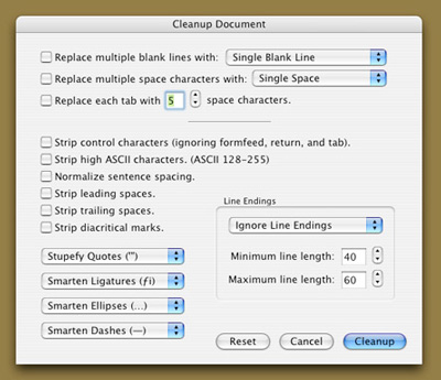
A. Unfortunately, no. Design software is not yet smart enough to sense inch and foot mark usage (also called primes) and leave them alone during the import process. But rather than doing a tedious search and replace in Quark and InDesign to convert the smart quotes back to primes, I suggest you correct all punctuation in the text document before importing. An easy way to do this is with Text-Edit Plus, a nifty $15 shareware from Trans-Tex Software that can "smarten" and "stupefy" quotes (as well as ligatures, ellipses, em dashes, and a bunch of other things) for a selection of text or an entire document. I can't live without it!

Figure 3. Among the many cool features of Text-Edit Plus is its ability to "smarten" or "stupefy" quotes for a selection or an entire document, thus converting them (back) to inch and foot marks if necessary.
Ilene Strizver, founder of The Type Studio, is a typographic consultant, designer, writer and educator specializing in all aspects of visual communication, from the aesthetic to the technical.
Ilene formerly was the director of typeface development for International Typeface Corporation (ITC) where she developed more than 300 notable text and display typefaces. Her latest book, Type Rules! The designer’s guide to professional typography, 2nd edition, has received numerous accolades from the type and design community. She conducts Gourmet Typography workshops internationally.
Email: info@thetypestudio.com
Company Profile: The Type Studio
Company URL:
Back to Columns
page
| 


